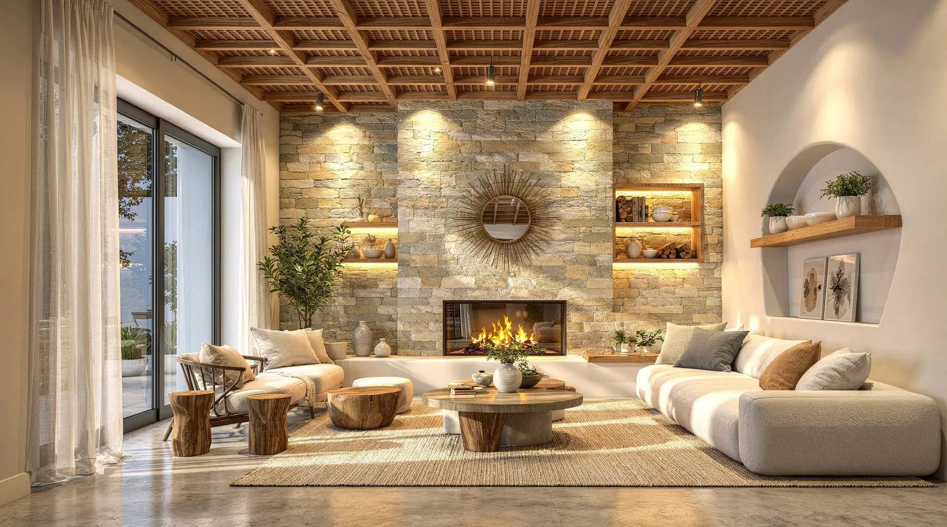
A technically correct 3D model can still produce a render that feels flat, artificial, or obviously computer-generated.
The problem is usually not the model itself. More often, realism breaks down because of lighting, material response, texture scale, camera setup, reflections, or small visual details that don't behave the way they would in a real space.
The good news is that you don't always need to rebuild the scene from scratch. With a few targeted improvements, you can make an interior render feel far more convincing while keeping the original design intact.
Key Takeaways
- Camera perspective, lighting direction, and material response cause most of the "fake" look in interior renders, not model detail.
- Fix issues in order of visual impact: camera, lighting, materials, texture scale, shadows, reflections, then small imperfections.
- Perfect surfaces, perfect reflections, and razor-sharp edges are the fastest giveaways of an unrealistic render.
- AI rendering can improve realism on an existing model view without redesigning the scene.
This guide covers the most common reasons interior renders look unrealistic, how to fix them, and where AI rendering can speed up the process.
Start With the Camera Before Touching Anything Else
One of the fastest ways to make an interior render feel unnatural is to use the wrong camera angle. A room can have excellent materials and lighting, but if the perspective feels distorted, the image will still look wrong.
For most architectural interiors, keep the camera at a believable eye level and avoid an excessively wide field of view. Very wide lenses may help fit more of the room into frame, but they also stretch furniture, exaggerate corners, and make the space feel larger than it really is.
What to check:
- Keep vertical lines straight wherever possible
- Avoid placing the camera too close to walls or furniture
- Use a focal length that feels architectural rather than dramatic
- Frame the room around a clear focal point
- Leave enough breathing room around important objects
A good camera setup should make the viewer feel like they're standing inside the room, not looking through a distorted lens.
Fix Flat Lighting
Lighting is usually the biggest difference between a basic 3D render and a photorealistic one. Real interiors rarely have perfectly even illumination: light changes across a room depending on distance from windows, wall orientation, material reflectivity, artificial fixtures, and shadow. If every surface is equally bright, the result often feels synthetic.
Natural Light Should Have Direction
Daylight should enter the room from a believable source. If there's a large window on one side, surfaces closer to that window should generally receive more light than areas deeper inside the space, with subtle falloff, shadow, and contrast as it fades.
Artificial Light Should Affect the Room, Not Just the Fixture
A common mistake is making lights visible without showing how they illuminate nearby surfaces. A pendant light, wall lamp, recessed light, or floor lamp should create a believable effect on surrounding walls, ceilings, furniture, or flooring. At the same time, avoid excessive bloom, glowing halos, or blown-out fixtures, since these effects can quickly make a render look stylized rather than realistic.
Watch for Overly Bright Interiors
Bright doesn't automatically mean realistic. If shadows are completely removed and every corner is equally exposed, the image loses depth. A realistic interior usually contains a mix of bright areas, midtones, soft shadows, and darker recesses.
Make Materials React Naturally to Light
Materials aren't defined by colour alone. Two materials with the same colour can look completely different depending on roughness, reflectivity, surface texture, and how they respond to light. This is where many interior renders start to feel artificial.
Wood Shouldn't Look Like Printed Wallpaper
Wood needs visible grain, but it also needs believable surface response: soft reflections, subtle roughness, small tonal variations, directionally consistent grain, and slight imperfections depending on the finish. Perfectly uniform wood often looks synthetic.
Stone Needs Depth and Variation
Marble, travertine, granite, and other stone surfaces shouldn't look like flat image textures. Veining should follow the geometry naturally, and the material should respond correctly to light. Highly polished stone may show stronger reflections, while honed stone should appear softer and less reflective.
Fabric Should Feel Soft
Sofas, curtains, cushions, rugs, and upholstered furniture often look fake when they're too smooth. Small changes in texture, edge softness, folds, shadow, and surface roughness can make a major difference.
Metal Needs Controlled Reflections
Metal is one of the easiest materials to get wrong. A metallic surface with no reflections can look like plastic; one that reflects too much can look like a mirror. The correct balance depends on the finish, whether it's brushed steel, brass, chrome, or blackened metal.
Check Your Texture Scale
A high-resolution texture can still look unrealistic if the scale is wrong. Oversized wood grain, tiny floor tiles, stretched stone veining, or repetitive fabric patterns immediately reveal that the image is a render.
Common texture problems:
- Timber grain that is too large
- Marble veins stretched across multiple surfaces
- Floor tiles with unrealistic dimensions
- Texture repetition that is too obvious
- Different surfaces using inconsistent scale
Before rendering, compare the texture size with real-world dimensions. A 600mm floor tile should look like a 600mm floor tile. A timber plank should have a believable width. Stone slabs should align with the actual geometry. Small scale errors can have a surprisingly large visual impact.
Reflections Should Be Present, But Restrained
Real interiors contain reflections everywhere: glass, polished floors, stone, metal, glossy cabinetry, screens, decorative objects. But reflections are rarely perfect. If every reflective surface behaves like a mirror, the render starts to look artificial.
A polished dining table may produce a sharper reflection than a matte countertop. A brushed metal fixture may show broad, soft reflections rather than a crisp image of the room. Glass may reflect the environment while still showing what's behind it. Photorealism often comes from getting these subtle differences right.
Add Depth Through Shadows and Contact
Objects need to feel physically connected to the room. If furniture appears to float slightly above the floor, or objects don't cast believable shadows, the scene loses realism. This is especially noticeable around chair legs, sofas, tables, rugs, cabinetry, decorative objects, and wall-mounted fixtures.
Soft contact shadows help show where objects meet surfaces. Even very subtle shadowing can make a room feel much more grounded.
Avoid Perfect Surfaces
Perfect surfaces are one of the biggest giveaways of CGI. Real materials contain variation: walls may have slight tonal changes, fabric may crease, timber may vary from plank to plank, stone may have irregular veining, metal may show soft imperfections. This doesn't mean adding dirt or damage everywhere. The goal is simply to remove the sense that every surface is mathematically perfect.
Small imperfections that help: slightly varied roughness, subtle fabric folds, small changes in colour, natural texture variation, realistic edge softness, minor surface irregularities. Use these carefully. Too much imperfection can make the render look intentionally distressed.
Keep Edges Realistic
In the real world, very few objects have infinitely sharp edges. Countertops, table edges, cabinetry, walls, furniture, and joinery usually have some form of bevel, rounding, or softness. If every edge in the model is razor sharp, light can't catch those surfaces naturally. Small bevels create highlights that help objects feel solid and three-dimensional. You don't need large rounded corners; even a subtle edge treatment can improve realism.
Use Composition to Make the Render Feel Intentional
A realistic render isn't only technically accurate. It should also feel like a considered architectural photograph. Think about where the eye is meant to go.
A good composition often uses a clear focal point, foreground/midground/background separation, balanced negative space, leading lines, natural framing, and visual hierarchy. Avoid trying to show every feature of the room in a single image. Sometimes a tighter crop communicates the design better than an ultra-wide shot.
Don't Overprocess the Final Image
Post-processing can improve a render, but it can also ruin one. Heavy sharpening, excessive contrast, strong saturation, artificial HDR effects, or aggressive colour grading can make an otherwise realistic image feel processed. The best post-processing is usually subtle: keep an eye on exposure, white balance, contrast, highlight recovery, shadow detail, saturation, and sharpness. The goal is to make the image feel photographic, not filtered.
Pay Attention to Objects That Often Get Distorted
Even strong renders can lose credibility because of one distorted object. Common problem areas include books, text, artwork, plants, hands or people, decorative objects, thin furniture legs, and complex lighting fixtures.
Zoom into the final image and inspect these details. A room can look excellent from a distance while still containing small artifacts that make the image feel generated. Where needed, correct these areas selectively rather than rerendering the entire scene.
Keep the Design Consistent When Using AI
AI can dramatically improve realism, but it can also change more than intended if the workflow isn't designed around architectural fidelity. For architects and interior designers, realism is only useful if the design stays recognizable.
That means preserving geometry, furniture placement, material choices, lighting fixtures, proportions, openings, camera angle, and overall design intent. The best AI rendering workflows improve how the scene looks without redesigning the scene itself, which matters most when you're working on a client-approved model and only want to improve realism.
How AI Can Make Interior Rendering Faster
Traditional rendering often requires a long sequence of manual adjustments: tuning lighting, materials, reflections, environment settings, render samples, denoising, and post-processing before the image starts to feel finished.
AI rendering changes that workflow. Instead of rebuilding materials and lighting from scratch, you can start with an existing 3D model view and use AI to generate a more realistic version of the same design. For example, with Vibe3D, you can upload a view exported from SketchUp, Revit, Archicad or Rhino and use the AI interior rendering tool to create a more photorealistic version while keeping the source view as the visual reference.
This is useful when the design is already resolved but needs improved realism quickly. You can also make targeted changes later, like adjusting lighting, refining materials, or changing the mood of the image, without rebuilding the full scene.
A Simple Checklist Before Your Final Render
Before calling an interior render finished, check the following:
- Is the camera perspective natural?
- Does the lighting have a believable source?
- Are shadows present where objects meet surfaces?
- Do materials respond differently to light?
- Is the texture scale correct?
- Are reflections realistic rather than mirror-like?
- Are the edges too sharp?
- Does the room have enough depth?
- Are there any distorted objects or visual artifacts?
- Has post-processing changed the design or material colours too much?
If several of these feel wrong, fixing them will usually improve the image more than simply increasing render quality or resolution.
What Actually Makes the Biggest Difference?
When improving an interior render, focus on the changes with the greatest visual impact first. In most cases, the order should be: camera, lighting, materials, texture scale, shadows and depth, reflections, small imperfections, then final post-processing.
There's little value in perfecting tiny decorative details if the lighting and camera still feel wrong. Start with the fundamentals.
Frequently Asked Questions
Why do my interior renders look fake?
The most common reasons are flat lighting, incorrect material response, wrong texture scale, overly sharp edges, weak contact shadows, and unrealistic camera perspective.
How do I make an interior render look more realistic?
Start with lighting and materials. Make sure light has a clear source, shadows are visible, textures are correctly scaled, and materials have believable roughness and reflections.
Do I need expensive rendering software to create photorealistic interiors?
Not necessarily. Traditional render engines give detailed control, but AI rendering tools can now produce high-quality results from existing 3D model views without requiring a complex rendering setup.
Can AI improve an existing interior render?
Yes. An AI render enhancer can refine lighting, material realism, depth, and overall visual quality on a render you already have. The key is using a workflow that preserves the original design rather than changing the scene.
Can I turn a SketchUp or Revit model into a photorealistic render with AI?
Yes. You can export a view from SketchUp, Revit, Archicad, Rhino, or another 3D tool and use an AI rendering platform such as Vibe3D to create a more realistic version of the scene. See our guides on how to render in SketchUp and Revit for tool-specific workflows.
Final Thoughts
Photorealistic interior rendering is less about adding more detail and more about making every part of the image behave naturally. Good lighting has direction. Materials react differently to light. Objects feel grounded. Textures have the right scale. Reflections are controlled. Camera perspective feels believable.
If those fundamentals are right, even a relatively simple 3D model can produce a convincing image. And if your design is already complete, an AI-powered 3D rendering platform like Vibe3D can help you get there faster without rebuilding the scene from scratch.